In today’s digital landscape—more than ever—people are aware of typography, design and how the world looks around them. Gary Hustwit records this in Helvetica, a documentary about how fonts affect our everyday lives. Most notably, Helvetica ushers in the larger conversation about global visual culture, detailing how and why people are progressively more mindful about the visual impact of design.
“The world is full of beautiful fonts—choosing the right one for your next project can be a daunting task.”
When working with a digital marketing agency, it is important to be prepared to discuss fonts during the creative process. And you may hear terms like sans serif, slab serif, or script—but this isn’t a bunch of mumbo jumbo, it’s science!
Here are five tips to help you understand fonts and why they are so important.
1. Typefaces vs. Fonts
Typefaces, fonts… what’s the difference? Here’s the easiest explanation to remember:
- A typeface is a grouping of fonts that have similar characteristics.
- A font refers to an individual member of a typeface.
Take Gotham for instance:
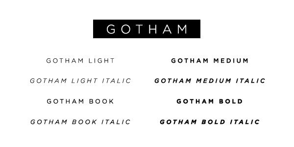
Gotham has many font variations, but each falls within the parent typeface, Gotham. Specifically, Gotham Italic is a font; it resembles all things Gotham but looks slightly different. Think of it as one big happy family—each font is unique and special, but they all share the same typeface name.
Font Tip: Knowing the kinds of typefaces you have to work with or want to use will give you a good foundation as you develop your digital presence.
2. Know the Big Players
There are an overwhelming amount of fonts at our fingertips, but first let’s talk about the main categories of fonts out there.
Serif: Serif is the slight projection at the end of a stroke that’s most commonly seen at the bottom of letters. If you look closely, some fonts will have “little feet” on them. This is what characterizes it as being a Serif font. This allows the eye to flow through sentences with ease.
Sans Serif: Fonts that are Sans have no “feet,” or serif. Take a look at the diagram:
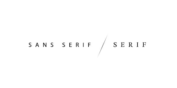
You can clearly see the difference above between a Sans Serif font and a Serif font. Sans Serif fonts are often modern, trendy and streamlined, however they tend to be harder to read at smaller sizes.
Script: This font type is known for its elegant, light and professional appeal. You often see this kind of font written on wedding invitations, diplomas or certificates. Use this kind of font sparingly. It’s not designed to be used as body copy or used in small spaces.
Display: You often see this kind of font on movie posters, newspapers, banners, etc. It’s intentionally designed to grab your attention or to give emphasis to a certain area. This is another font that’s not meant to be used in large quantities—a little goes a long way.
Hand Lettering: These kinds of fonts have hand rendered characteristics. Maybe they look as if a child has written it, or as if someone used a Sharpie or whiteboard marker to jot something down. Designers like to use fonts like this because they add a human element to the design—something that people can relate to.
Font Tip: There are a lot of great fonts out there, but keep in mind, you get what you pay for. Make sure the font you choose is high quality. For a more in-depth look into more typography terminology, check this blog post out.