Blue Herring
A Revolutionary Insurance Sales Company Gets a Brand Overhaul
Scope
Overview
The founders of Blue Herring are creating a radically new approach to buying life and disability insurance — but their original name and brand identity pigeonholed them as just another financial services provider. They needed a name, logo, look, and feel that would set them apart from the crowd while communicating their brand values of transparency, trust, and innovation in the insurance industry.

What's in a name?
Between traditional brokers and disruptive online shopping tools, the insurance sales space is crowded. Blue Herring came to Vital with a conventional financial services name that didn’t match their brand vision. And, while their process and philosophy is truly new and different, the playful, whimsical naming style of many of their online competitors isn’t a good match for the company’s deep commitment to ethics and transparency in insurance sales. We created and evaluated naming options based on a matrix of factors including theme, sound and mouth-feel, abstract association, emotional resonance, and practical considerations such as URL availability and ownability. Blue Herring hit the sweet spot: refreshing, inventive without being frivolous, and suggestive of the brand’s willingness to “swim against the current” of prevailing insurance sales models.
Bringing the brand to life
The new name provided the jumping-off point for a complete reinvention of the brand, from logo and identity to voice and tone, as well as colors, shapes, illustration style, and other design and messaging elements that establish the foundation for Blue Herring’s digital and physical presence.
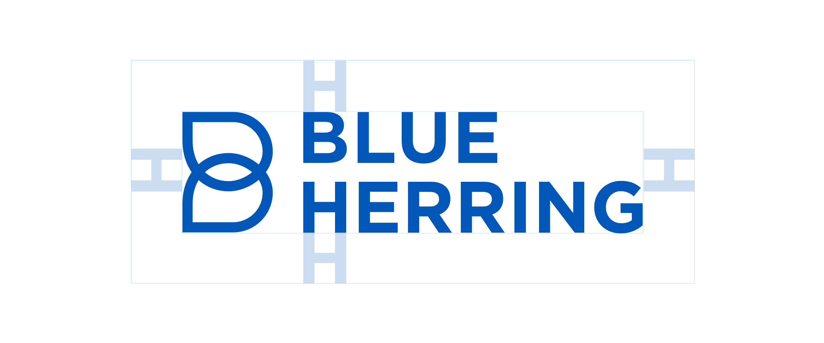
The Logo
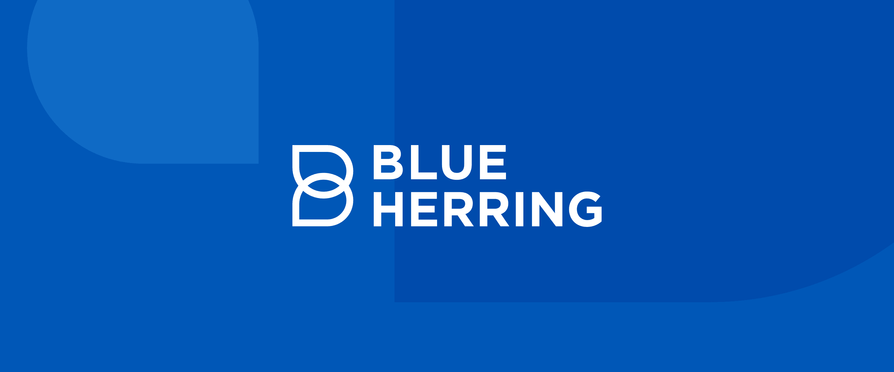
Incorporating shapes suggestive of both drops of water and speech bubbles, the Blue Herring logo expresses clarity, accessibility, and transparent communication.
The Messaging
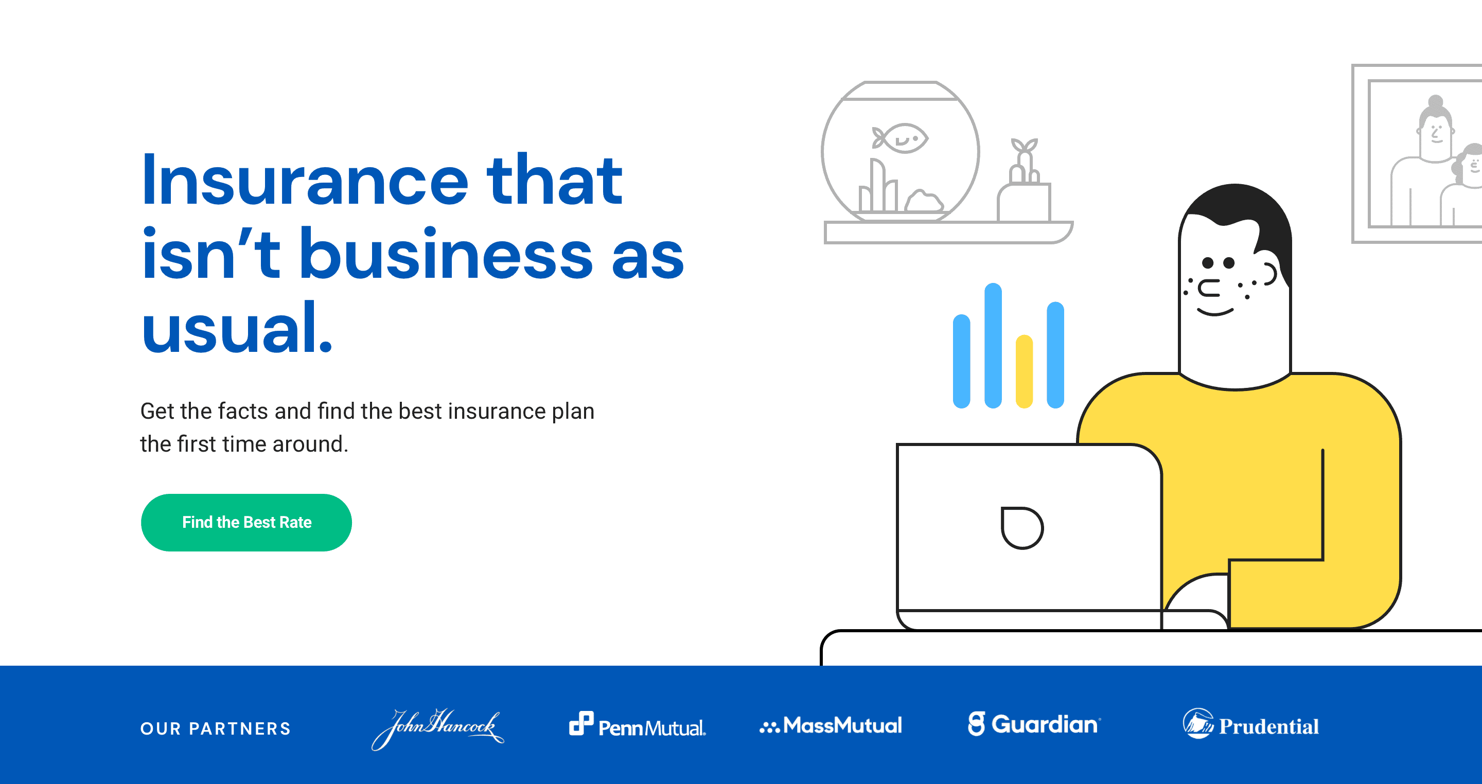
The Blue Herring brand voice is clear, straightforward, and declarative. Messaging focuses on the brand’s end benefit to consumers: the confidence that they’re getting the right insurance policy at the best price.
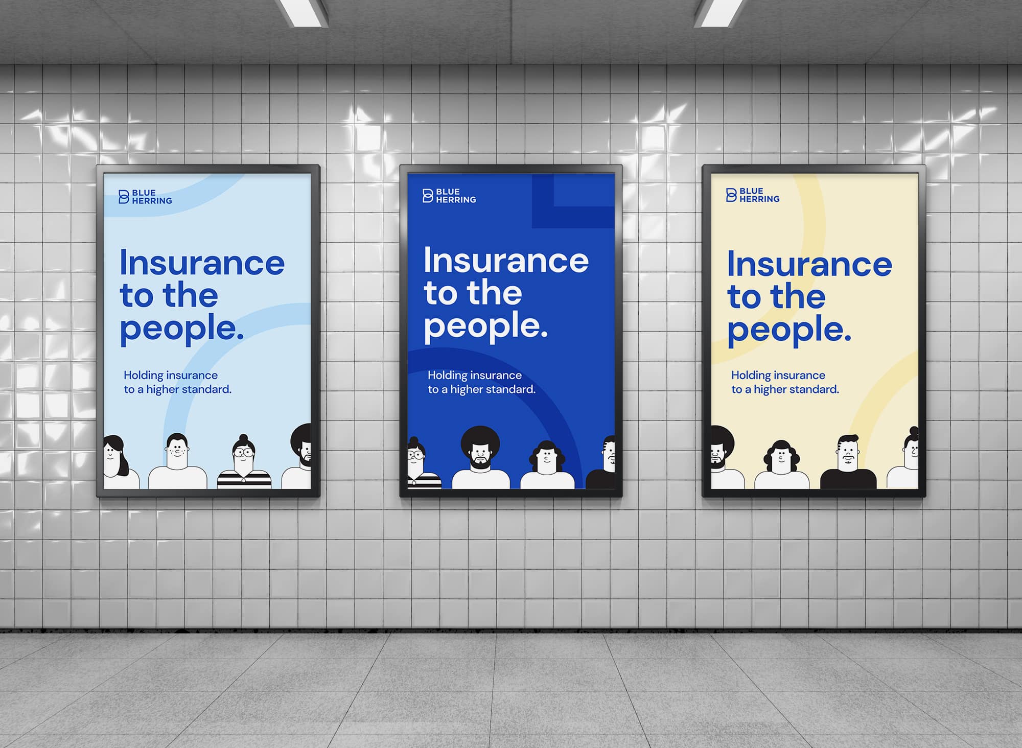
The Graphics
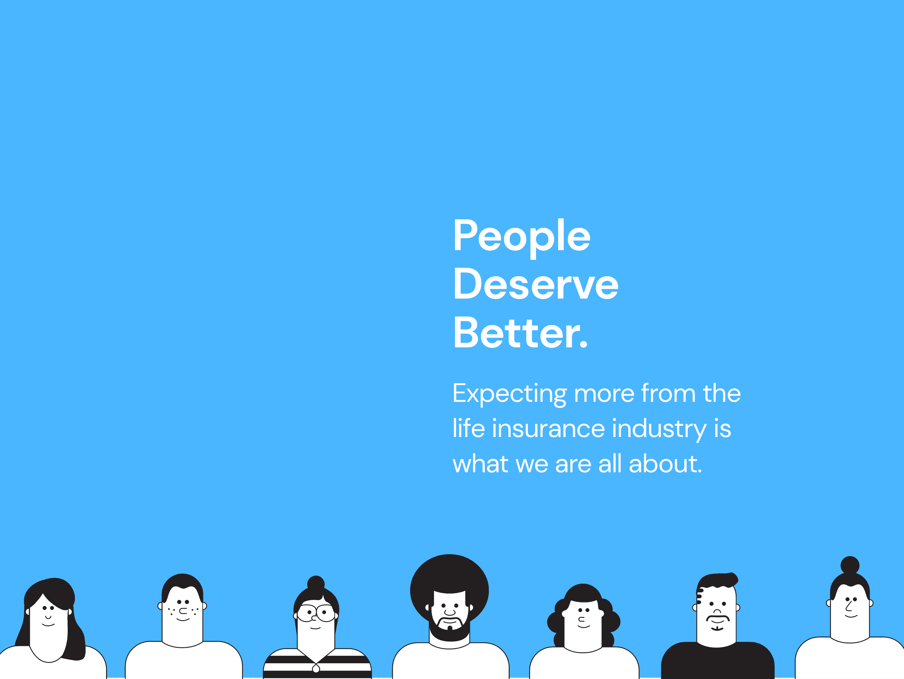
Bright pops of yellow and simple illustrations give the brand a friendly, personal feel, while icons in two tones of blue situate the brand within its market category without being stuffy or overly corporate. The logo shape is leveraged as a graphical element to further reinforce the brand’s core value of transparency.
Ready to Start A Project?
Let’s do this! We can’t wait to hear about what you’ve got planned. Fill out the form below and let’s get started.