You only get one chance to make a first impression. At Vital, we know this all too well. Launching 50+ websites a year for some of the biggest B2B and B2C brands in the world has taught us just how crucial the initial look and feel of the homepage is. That’s why we’ve decided to share some insider tips on homepage best practices.
In this multi-part blog series, we’ll be detailing the necessary pieces of a user-friendly homepage and outlining some often-neglected must-haves. First up: the header and navigation design.
Because let’s face it — without a great user interface design and user experience, your website is basically just taking bandwidth away from the many cat memes we all know and love.
The Header
Just like in a Microsoft Word document, the header is the very top of your website. This is where your logo and navigation live, which are two of the first things people will see when they land on your site.
Your header is one of the most valuable sections of your entire website, especially since it takes top real estate on every one of your webpages. Visitors should be able to recognize your brand and understand what your company does as soon as they land on your website, and the header is one of the most important tools to make sure that happens.
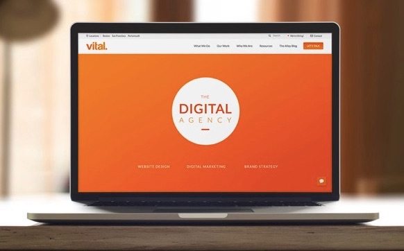
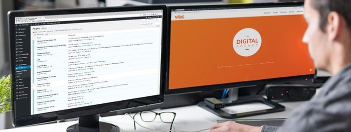
Here’s Vital’s website header to give you a visual:
Notice how compact and clean it looks? (Thank you.) That’s because the header design determines the viewport of a website, which is the area that’s visible as soon as you land on the page. Because we have such a condensed header, we’re able to have some fun with the rest of the page, like the hero and product sections*. Just remember: The bigger the header, the smaller the viewport and the less space you’ll have for adding other valuable elements.
*Pssst: We’ll be talking about best practices for these section in a future blog, so stay tuned!
What Should Be in the Header?
Website header design should always include:
- Your company logo – Make sure it follows your brand guidelines and is responsive to how the page scrolls. There’s nothing worse than a navy blue logo on a black background.
- Navigation – This is a loaded topic. More on it coming up!
- CTA/conversion tactic – Making this prominent will increase the likelihood of your website visitors taking action, like contacting you, ordering samples or finding their local sales representative.
- Your phone number – And make sure it’s trackable! If you want customers to actually call you, make sure they can see it as soon as they land on your website.
And, if applicable for your business, you should also include:
- Login section – This is primarily for existing customers in an industry like SaaS, or if your sales team needs to access backend functions.
- Search functionality – And segment it as much as possible! Someone searching on your blog will probably only want blog results, as opposed to every single page that mentions a certain keyword.
- Announcement/alert bar – This appears at the very top of a webpage and is usually one or two sentences with a CTA. It lets you share custom messages like sales or upcoming webinars without being as aggressive as a popup. See the webinar example below:

- Shopping cart – eCommerce websites should have a way for customers to quickly check the items in their shopping cart, so make sure this stays in the header!
This all sounds like a lot of stuff, right? But, if designed effectively, you can end up with an incredibly good-looking header section like this:
The Navigation
Arguably the most important part of your header is the layout and design of the navigation. This section is like a table of contents for all the pages on your website. It’s how users can find what they need from you, so it’s pretty crucial that you get it right.
Designing a new website? Download our guide on everything you need to know first.
Webpage Hierarchy
Before we start talking about the navigation design, it’ll help to understand the hierarchy of website pages. And since we’re talking about hierarchies, try to imagine these as the family tree of your website.
The pages listed in the navigation should be your Top-Level pages. These are the important ones like Products and Services and usually have related subpages. On the family tree, these would be considered the mommas and the poppas of your website.
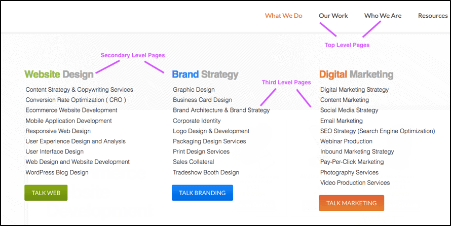
When you hover over the Top-Level pages, the navigation should drop down into your Secondary-Level pages, which we’ll call the children. For Vital, these include Website Design, Brand Strategy and Digital Marketing.
Under Secondary-Level pages are the Third-Level pages, so the grandchildren of the family tree. For example, under Website Design, the Third-Level pages are Content Strategy & Copywriting Services, Conversion Rate Optimization (CRO), etc.
Some sitemaps might have Fourth-Level or even Fifth-Level pages. Whether they appear in the navigation menu will depend on your UX goals, their relevance and the size of your website.
Okay, now let’s talk about how to place these pages in the navigation.
Hierarchies in the Navigation
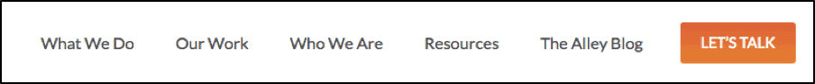
For reference, here’s the navigation part of our website again:
 Think about how and why visitors are landing on your homepage. If you have the right SEO strategy, it’s hopefully because of a Google search. They likely have a problem they are hoping you can solve, and the navigation helps make it clear that you have the capabilities to do so.
But since the ideal navigation design can significantly vary across industries and companies, there are different types you can utilize.
Wait – There Are Different Types of Navigations?
Oh yes! You didn’t think there’d only be one general model used across a billion different websites, did you?
Main Navigation — Every website will have a main navigation. This area should call out your Top-Level pages and immediately explain what your business offers.
Example: If you’re a transportation company, having a Products page in your navigation won’t really make sense since you offer a service. In cases like this, being specific is key.
Even Better Example: Without even seeing the company name or tagline, the navigation design below makes it clear that this business provides residential flooring products.
The main navigation should be determined by the amount of content that will be on your website. So, if you only have five webpages, you’ll probably be able to get away with including them all in the main navigation. Otherwise, you’ll need to start categorizing and prioritizing.
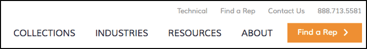
Utility Navigation — This section of the navigation includes the secondary actions you want your visitors to take. Typically, this includes logging in, performing a search, viewing careers or checking their shopping cart. It’s also where your phone number should be listed. The utility navigation is usually not as prominent as the main navigation and can have placement above it, in the right-hand corner.
Example: In the utility navigation below, the secondary links include Technical, Find a Rep and Contact Us, plus the phone number.
Mega Navigation — 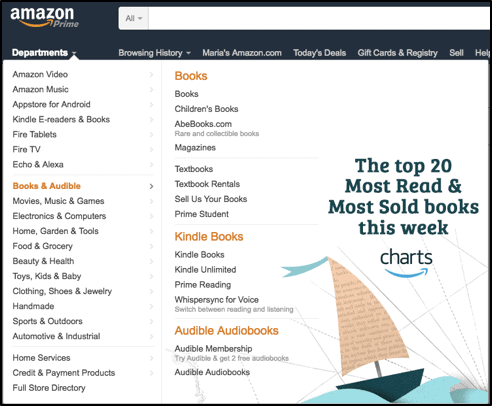 Probably the best example of a mega navigation design is Amazon’s. In fact, their navigation is super mega, but that’s because their product offering is so broad. This makes sense for their business, since people use the site to buy anything from books to home décor to music to coffee. Because of this, they need to display as much as possible, as soon as possible.
With Amazon as the example, it’s no surprise that these types of navigations are most often seen on eCommerce websites. That’s because their goal is to get people to buy their products, and how can that happen if they aren’t all immediately listed?
Keep in mind that a mega navigation design will take up a substantial amount of real estate once displayed
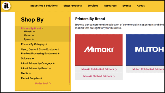
Third-Level Navigation —  You can also take the approach of using a third-level navigation, pictured in the screenshot to the right. This navigation comes in handy when there are certain product brands or unique items you want to call out.
What About a Multi-Site Strategy?
For corporations with multiple divisions, the strategy behind the header and navigation gets a bit more complex.
Companies like Gap choose to keep their entities under the same URL and website structure. So, in the website header for gap.com, you can also access Banana Republic, Old Navy and Athleta, which are all brands Gap owns.

If you want to employ this type of strategy, you need to use a tabbing, global and local navigation.
Tabbing Navigation — To explain these three types of navigations, we’ll use this example of Rapid Manufacturing to explain these three techniques:
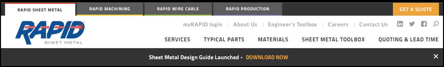
The very top of the header in the example is what’s known as the tabbing navigation. This is where the user can migrate between the different sub brands (Rapid Sheet Metal, Rapid Machining, Rapid Wire Cable and Rapid Production).
These tabs will appear on every page and you can tell which brand’s website you are on by the white highlight.
Global Navigation — Just like the tabbing navigation, the global navigation stays constant on every page. This is where you’d have links to pages that are related to all the sub brands, like careers, login and contact pages.
With a global navigation, you’re able to make a change to these links that will be reflected on all the webpages. So, updating across brands becomes super easy.
Local Navigation — The local navigation is where you can get specific for each sub brand. These pages are going to be like the main navigation on other websites. In the example, all the pages are going to be unique to each brand, which is why this navigation should be custom-made.
 This is because things like the service offerings, quoting and lead times are going to vary. Updating these navigations will be different across each brand.
Where Should the Navigation Be Placed?
Sticky Header & Navigation — When landing on the homepage, the visitor should see the biggest version of your header, including the navigation. This is because they might be new to your website and will need as much information at first glance as possible.
But as they scroll down, the header should still be visible in its most truncated format. This is so the other sections of your homepage don’t disappear if the user hovers over the navigation.
So, if you’re going to have a mega navigation menu with more options than a Chinese restaurant, you’ll need to significantly condense how it looks while scrolling so that your visitors aren’t constantly overwhelmed with options.
Horizontal Navigation — As we’ve previously mentioned, you want the maximum viewport possible on your website. A horizontal navigation takes up way less space than a vertical navigation, so you have more room to play with. Plus, people are more likely to scan the entire navigation if it’s horizontal because we read from left to right.
Vertical Navigation — You’ve probably noticed that most of the examples in this article so far are of horizontal navigation designs. But there are instances where a vertical navigation is useful.
 A vertical navigation should be used as a secondary area or for eCommerce applications. This is a great tactic to use to ensure your main navigation is still visible while website visitors are scrolling by your available products.
Hamburger Navigation — 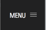 At one point in time, the hamburger navigation design was the must-have craze for websites. The three horizontal lines in the left or right-hand corner of the header are supposed to entice the visitor to click, and then the full navigation expands. Yes, that means you would have to click on something before you even see the Top-Level pages. Talk about inconvenient.
However, there’s a time and a place for this technique to shine. But the consensus is that this design hides the navigation and leads to a weak user experience. Plus, we’ve spent the majority of this article talking about how important your navigation is, so why would you want to go and hide it?
With that said, the hamburger is still useful for mobile websites since it condenses the header and doesn’t take up the already limited screen space. It’s also used a lot on simple brochure-ware sites. These websites have a very modest design, minimal pages and are used primarily as a resource that sales people can use and share with potential customers. Basically, they are like an interactive brochure. But even though these sites are simple, you still need to incorporate best practices for optimal user experience.
So, there you have it: the lowdown on website header and navigation design. But there’s so much more involved in crafting the perfect homepage, and we’ve only cracked the surface. Stay tuned to our blog to hear more best practices on the other sections of the homepage. Or, let us know if you have any questions or comments about this blog!

