Imagine stripping all the words from a piece of marketing collateral — the homepage of your website would be a great place to start. Once there’s nothing left but your logo mark (if you’ve got one — no brand names allowed), your colors and fonts, your photos, icons, illustrations, and other visual aspects of your brand, ask yourself a few questions:
- Would your customers still be able to identify your brand by name?
- Would people who have never encountered your brand be able to guess your industry or market category?
- What personality does your stripped-down homepage convey? Does it look happy, serious, trustworthy, fun?
- Is that the personality you want your brand to have?
- If your top three competitors removed all the words from their homepages, would you be able to pick yours out from the crowd?
- Would your audience?
This thought experiment is designed to help you determine the strength of your brand’s visual identity. It was inspired by a series of billboards by this iconic brand:
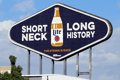
Of course, not every brand can get away with ads that omit the brand’s name entirely. (This one happens to be a member of the Obie Hall of Fame.)
Even if you’re not shooting for household name status, you want your brand to be recognizable, memorable, and compelling to your audience — whether that’s an audience of billions or a much more niche audience within your industry.
A strong visual identity plays a critical role in how your audience perceives your brand. But first things first…
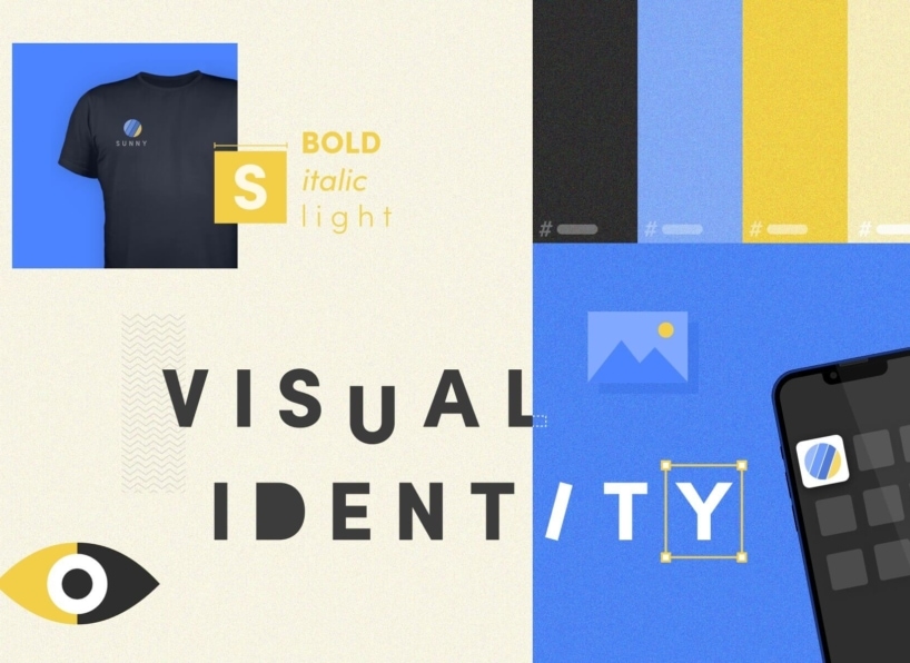
What Is a Visual Identity?
Your brand’s visual identity is the sum total of all the design choices that are used consistently to represent your brand.
The key words to keep in mind when it comes to brand identity are choice and consistency. If you’re not making conscious decisions about your brand’s visual identity, you’re probably missing some pieces of the puzzle. If you’re not applying your decisions consistently across all brand touchpoints, your design choices won’t do the work of identifying your brand.
A strong visual identity, like a strong brand in general, helps your audience recognize, remember, and connect with your company. Time to call up your favorite design team? Not so fast. Before you start defining (or redefining) your brand’s visual identity, there are some fundamental elements you need to nail down.
Brand Foundation First, Visual Identity Second
The best designers in the world won’t be able to create an effective visual identity if you don’t have a strong brand foundation. What makes a strong brand foundation? The relevant, differentiating value your brand offers to your audience.
Let’s break that down.
A strong brand is:
- Relevant. It addresses your audience’s pain points, needs, and desires in a way that resonates with them.
- Different. It stands apart from the competition in ways that are meaningful to your audience.
- Valuable. It makes your audience’s lives better, easier, more secure, more fun, etc.
Notice a common theme? That’s right: Your brand is all about your audience. So let’s start there.
Understand Your Audience by Creating Buyer Personas
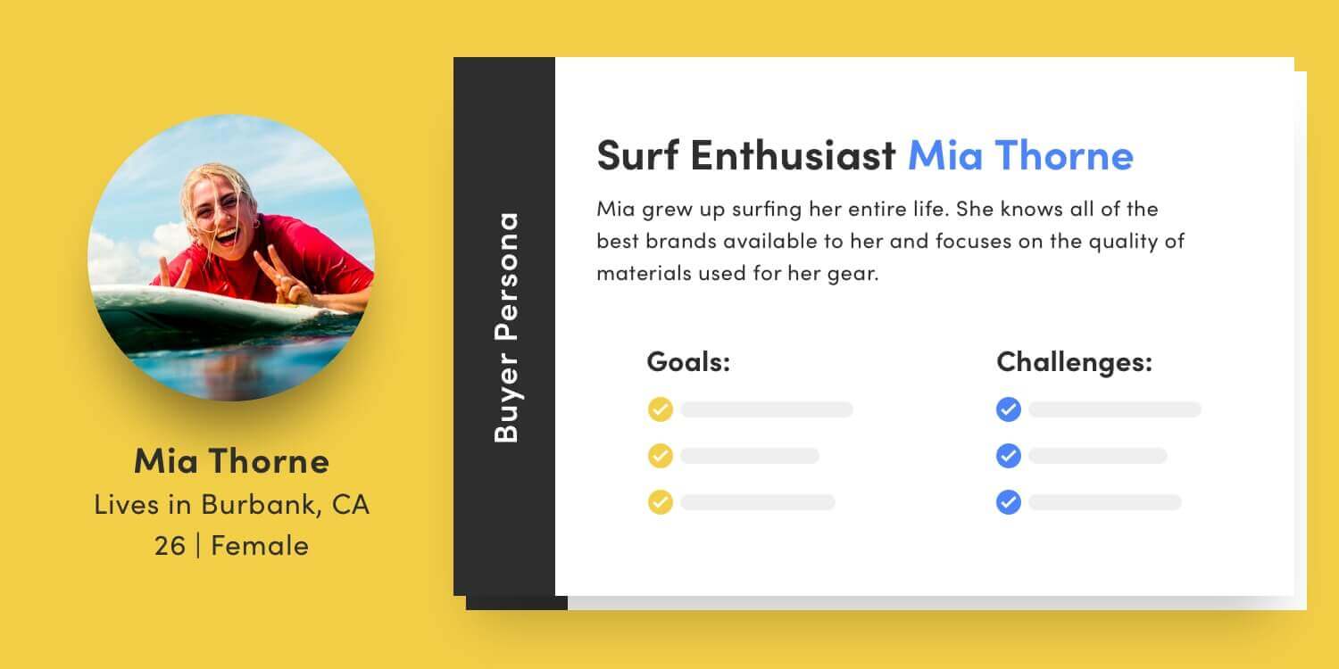
Who is your audience? What do they care about? How do you know?
When clients come to us for help with their brand’s visual identity, we begin by discovering everything we can about their ideal audience. We conduct interviews with actual or potential customers, and we gather further insights from company stakeholders, such as sales teams or whoever else has the most day-to-day contact with customers. Then we compile our findings into semi-fictional representatives of a brand’s audience.
Your buyer personas can be used to inform everything about how your brand communicates with your audience — including its visual identity.
Differentiate Your Brand through Competitive Positioning
It’s not enough to understand your audience. You also need to know what you’re up against so you can clearly set your brand apart through its visual identity. Start by asking these three questions:
- What are the “table stakes” within your market category that your brand must live up to in order to be considered by potential customers?
- What is the main functional benefit of your brand compared to the competition? In other words, what does your brand allow your customers to do differently?
- What is the main emotional benefit of your brand compared to the competition? How does your brand allow your customers to feel better than the other guys?
Even very functional brands convey emotion through their visual identity — and feelings are harder to copy than features and functionality. When you can link a differentiating functional benefit to a differentiating feeling, you are on your way to building a strong brand foundation.
Like buyer personas, competitive positioning will inform your brand’s visual identity, helping to determine whether your look and feel should be classic or contemporary, simple or intricate, playful or serious, and so on.
Tell Your Brand’s Story With a Messaging Framework
After buyer personas and competitive brand positioning, it’s important to nail down a few fundamentals of your brand’s story before you set your design team loose. At Vital, we work with our branding clients to create comprehensive brand messages that lay the groundwork for brand communications across all touchpoints.
You don’t need to define every aspect of your brand’s messaging before you create your visual identity. In an ideal world, your brand strategists, writers, and designers will work in tandem to make sure that your messages and your visual identity reinforce the same powerful idea of value for your audience.
If you want to speed up the process, focus on your core message:
- What am I?
- Who am I for?
- How am I different?
Often, when our brand team is working on a logo and visual identity for a new client, the lead designer will pop his or her head into my office to ask those three questions. Along with a whole bunch of other questions we ask our clients about their brand, the answers serve as a jumping-off point for establishing a strong visual identity.
What Makes a Good Visual Identity?
The hallmark of a strong visual identity is dead simple. It works. That is, it conveys your brand’s functional and emotional benefits effectively, sets you apart from the competition, and appeals to your audience.
But…how? To answer this question, I went to the source: Senior Graphic Designer and all-around brand nerd Ty Cooper.
Ty says: “It’s hard to talk about what separates good from bad when it comes to visual identity because it’s inherently subjective and dependent on the brand and the audience.”
That’s why Vital’s design team uses a simple four-point litmus test to make the process of creating logos and visual identities more objective:
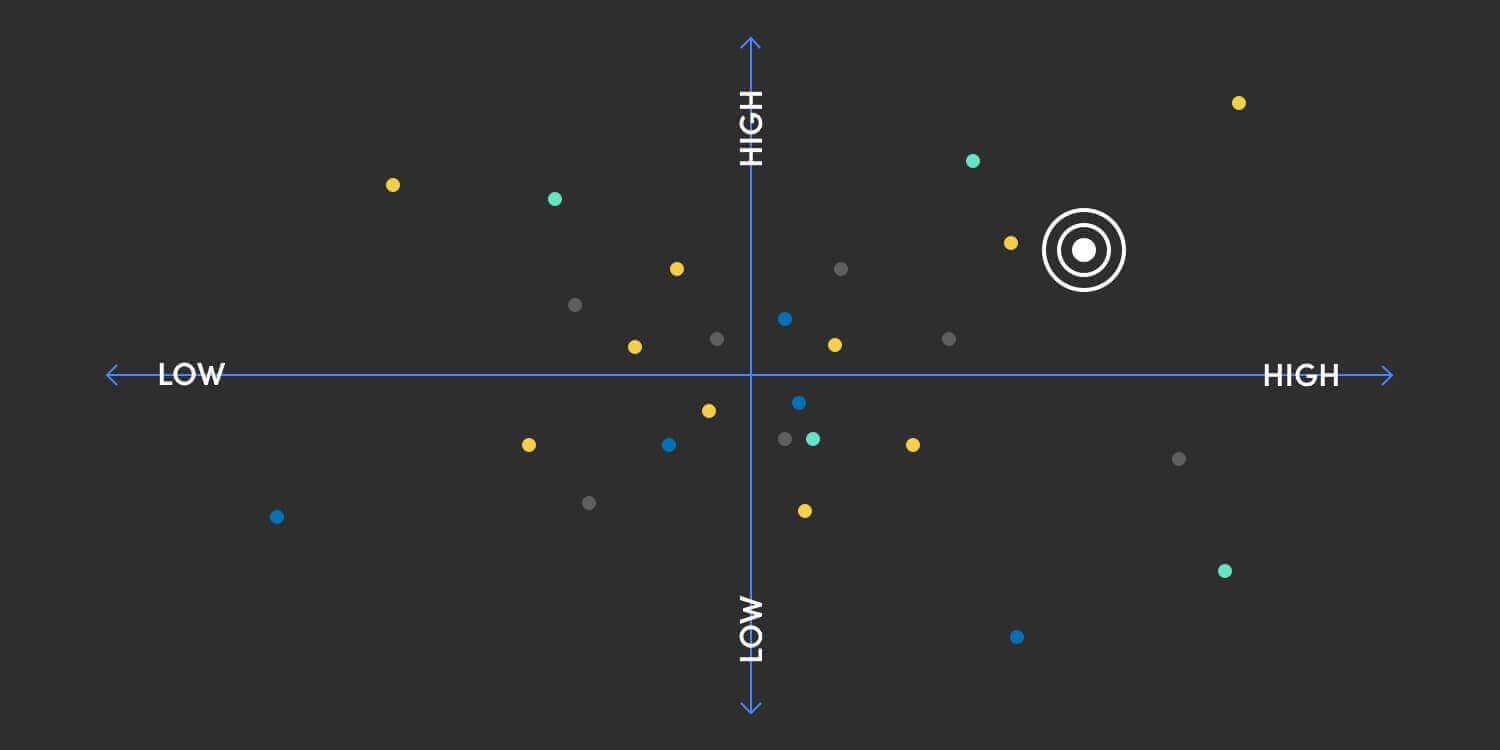
- Memorability. Can you sketch a rough approximation of your logo without looking at it? Can you pick your brand’s colors out of a lineup? Are there any shapes or other images that immediately come to mind when you think of your brand?
- Appropriateness. Does your logo and visual identity fit within your general market category? This one can seem tricky since you’re trying to stand out from the competition, but generally speaking, a car manufacturer should look automotive; a bank should look financial; a healthcare company should look medical; and so on.
- Uniqueness. Within the above constraints, does your visual identity stand out in the space in some way? Rather than random differences, the uniqueness of your visual identity should be relevant to your brand’s characteristics and your audience’s goals and desires.
- Utility. Do your logo and visual identity work in all the applications you need them to? Are the visual elements reproducible at different scales, including for mobile devices?
Note: A word about trends. You want your visual identity to feel fresh, and you also want to avoid having to refresh it every few years. As a general rule, we choose timelessness over trendiness, unless a brand is specifically built to be of-the-moment.
Where Does a Visual Identity Get Used?
Your brand’s visual identity gets used anywhere your customers interact with your brand. It also comes into play internally through corporate or employer branding.
Here are some examples of where you might use elements of your visual identity:
- Website
- Advertising
- Marketing
- Packaging
- Product design
- Merchandise
- Sales materials
- Presentation templates
- Letterhead
- Business cards
- Signage
- Office design
- Internal communications
What Are the Elements of Visual Identity?
Your brand’s visual identity is made up of all the design elements that represent your brand. If a design choice is used consistently across touchpoints, it becomes part of the way your brand is perceived. The elements of visual identity can include:
- Logo
- Brand colors
- Fonts
- Shapes
- Illustrations
- Icons
- Photography style
Five Examples of Brands With a Strong Visual Identity
If you think about some of the world’s most iconic brands, what do they have in common? A strong, consistent visual identity is definitely on the list. Apple, Coca Cola, Nike, etc. — most people can immediately picture what the brand looks like, including its logo, colors, and general look and feel.
Guess what else these brands have in common?
They’re huge, with gobs of money to spend on advertising to make sure everyone recognizes and remembers their brands. They’ve also been around a while. (Great brands aren’t built overnight.)
With this in mind, we’ve gathered a few more relatable examples to demonstrate what a strong visual identity looks like.
1. Roland
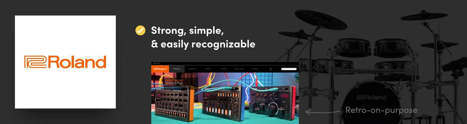
What Is It?
Roland Corporation makes electronic musical instruments and other electronic equipment. The brand is legendary within its niche, but unless you’re a music geek, you may never have heard of it before.
Why We Love It.
Roland’s logo is strong, simple, and easily recognizable, with a retro-on-purpose feel to it that lends authenticity to the brand.
2. Mohawk Paper
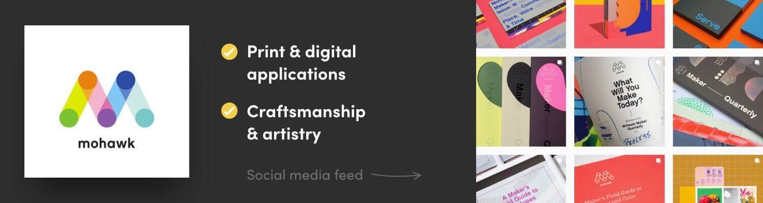
What Is It?
Mohawk makes high-quality paper, envelopes, and paper packaging material. They rebranded in 2012, launching a logomark that gives the brand more flexibility and extendability.
Why We Love It.
The “M” icon references the papermaking process, but you don’t need to know that to be struck by its impact. It looks great in a wide variety of print and digital applications, both in black and white and color. Beyond the logo, everything about the brand’s visual identity conveys fine craftsmanship and artistry.
3. Omega Yeast

What Is It?
Omega is a provider of high-quality liquid yeast for brewing beer. They sell to homebrewers as well as professionals.
Why We Love It.
The logomark is simple, easily recognizable, and reproducible on large and small scales. It is designed to look like both the letter O and a budding yeast cell under a microscope, which is obscure enough to make it extra appealing to beer nerds. The brand extends the logo concept beautifully across all touchpoints.
4. Asana
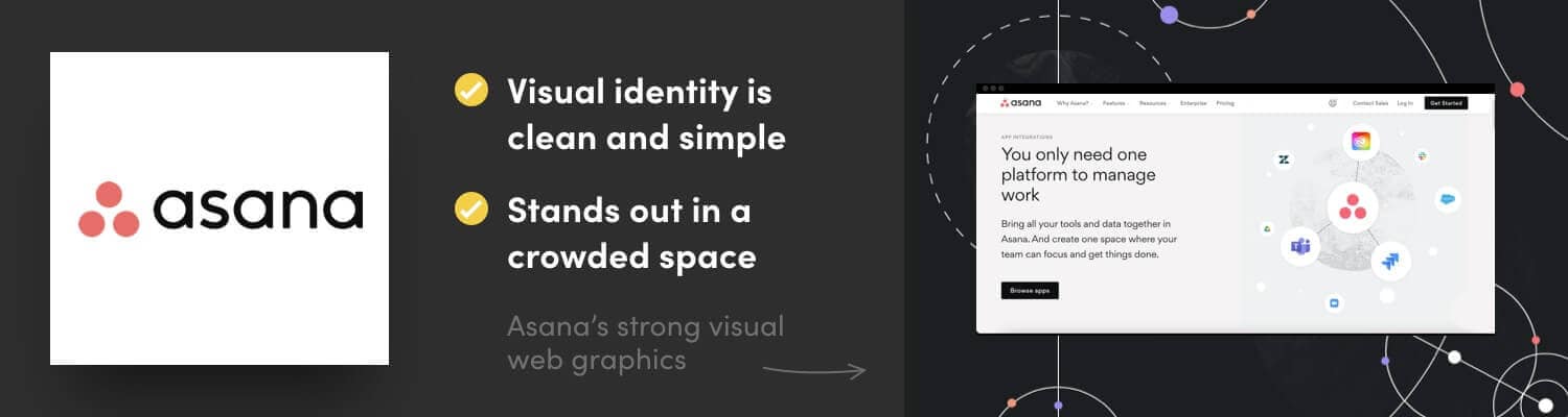
What Is It?
Asana is a collaborative work management tool aimed at enterprise-scale businesses.
Why We Love It.
The overall visual identity is clean and simple, conveying the brand’s benefit to its customers. At the same time, it stands out in a crowded space with thoughtful design choices that combine shapes and lines with a unique photography style.
5. Zendesk

What Is It?
Zendesk builds customer service software solutions that help companies deliver seamless support to their customers across channels.
Why We Love It.
Zendesk does a fantastic job of paying attention to all the details of their brand’s visual identity, from the simple fonts to the muted pastel color palette. Their logomark is a piece of design magic, readable as a simple Z in smaller applications and a clever combination of triangles and circles in larger formats.
Want Help Establishing a Strong Visual Identity for Your Brand?
Our brand strategy and design team loves to help new and established brands maximize their impact through their visual identity. Learn more about our approach to brand strategy, or fill out the form below and we’ll be in touch shortly to start the conversation.