
A mobile-friendly mushroom cloud is coming—is your website prepared?
Appropriately dubbed “Mobilegeddon,” the Google algorithm update unleashed on April 21 (today) effectively ups the ante on mobile-friendly websites as a ranking signal. What this means is that companies with a mobile optimized website may begin to see a rise in SERP rankings, while those without will realize a noticeable dip. If your company relies on its website for lead generation and sales and its not mobile friendly, this update could hurt.
But don’t freak out just yet. Let’s take a step back and talk about what this update truly means. Most importantly, let’s talk about the best way to prepare for it. You might have questions. Here’s what happened…
Google Expands Mobile Friendliness
Google’s announced its algorithm update Feb. 26, effectively starting the countdown for all owners of non-mobile friendly websites to get their act together and give the people what they want—which according to Google is “the most relevant and timely results, no matter if the information lives on mobile-friendly web pages or apps.”
The idea behind the update is that more and more people are using their mobile devices to access the Internet and conduct search queries, hence the need to weight SERP rankings more toward these usage patterns.
“This change will affect mobile searches in all languages worldwide and will have a significant impact in our search results. Consequently, users will find it easier to get relevant, high quality search results that are optimized for their devices.”
— Google Webmaster
If you’ve perused the many reaction pieces on the web since Google announced the update you’ve likely seen some teasers on what to expect. Some of the most pertinent details to know about the update come from sources like Search Engine Watch, Moz and HubSpot. Here are a few things we’ve learned to date:
- Penalties are on a page-by-page basis, not all-encompassing of your website as a whole.
- Google is currently working on a dedicated mobile index to go with the new mobile crawler
- The ability for Googlebot to crawl CSS & Javascript is a must in order to pass the “mobile-friendly” test
One thing we do know for sure is that once the clocks strikes midnight on April 21, searchers should find it easier to get relevant, high quality search results that are optimized for their devices.
So, that’s the quick version of the expected algorithm update. And the extra details are very helpful. But the truth is that no one really knows what the update will do until it happens (unless your name happens to be Doc Brown).
Scattered Speculation on Impact to Desktop SERPs
One of the biggest questions has been whether the update impacts only what users will see on their phones, or if it will resonate to desktop searches as well. Google’s answer has been a consistent “No.” So far there is no indication that your SERP rankings for desktop use will be impacted—but the speculation persists.
Vital’s very own SEO expert Dave Currier believes it’s only a matter of time before desktop searches are impacted. “I call bullsh*t” Dave said emphatically during a recent discussion about Google’s insistence that desktop search won’t feel the pain. Dave, aka the CEO of SEO, believes no one truly knows what Google will do next. Other industry leading experts are right there with him—many encouraging users to air on the side of caution just in case there are eventual desktop repercussions.
Regardless of what truly ends up happening, the Google update should be seen as an important step in shifting the conversation towards mobile. Consider it a shove in the right direction.
Why Is Mobile-Friendly So Important?
The advent of the smartphone, the rise of mobile Internet and overall improvements in user experience have revolutionized how consumers browse for information. No longer do people cozy up to their PCs for a night of online shopping and general browsing. No longer do people wait to get home to fire up their laptop in order to look something up. Instead, the easy access of mobile Internet means people are literally browsing, shopping, streaming, etc., anywhere and everywhere their phone can pick up a signal or connect to Wi-Fi.
60% of cell phone owners use their cell phone to access the Internet
So what does this mean for a business? It means conversions. It means leads. And ultimately it means money. If your business lacks a mobile-friendly website, then your bottom line is about to suffer.
How Do I Know How Much Traffic I’m Getting from Mobile Anyway?
It’s easy to determine how much traffic is coming from mobile. Use your Google Analytics.
If you’re unfamiliar with the process, here are some simple steps even the most novice users of Google Analytics can take to figure out their site’s mobile web traffic.
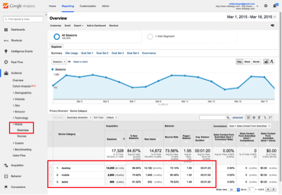
- Go to the left side menu and select “Audience.” Then select “Mobile”
- Select “Overview” to get an all encompassing idea of how much mobile traffic your website is getting compared to desktop and tablet users. The information available on this page includes everything related to customer acquisitions, customer behavior and even conversions. There’s even a helpful graph at the top to show you site traffic over days, weeks and months.
- You can even go as far as learning about what types of mobile devices are actually used to view your site by selecting “Devices.”
It’s never been easier to measure your mobile website traffic. Google even has a Mobile-Friendly Test you can use to find out if you’re in good shape.
What Can I Do To Make My Site Mobile Friendly?
There are likely a ton of companies out there who will immediately lose a large portion of the website traffic because their rankings (from searches coming from mobile devices) will tank. It’s probably a good idea to go mobile before it’s too late.
Luckily for you there are some things you can do in the very short term that will help you be prepared for the mobile revolution. Here are a few of them:
Select a “Mobile-only” design
If you’re not yet prepared to build a responsive website, then going with the “mobile-only” design is the simplest and most economical way to go. But let’s be real, you should ALWAYS strive for a responsive website. This should be considered a short-term solution.
Build a Responsive Website
If you’re more about the long game, then constructing a responsive site is the direction you should be heading in. The reason this is so important is that mobile web sites shouldn’t necessarily be mirror images of your website. Think about it. How many times have you visited a site that is not mobile-friendly and been completely turned off by how terrible the experience is. You end up bouncing out of there as quickly as possible. A site that is not responsive will appear on your phone just as it does on the computer screen—which I think we all can agree is pretty terrible.
A responsive site, however, will know if a user is attempting to view it from a mobile device and as a result will display it properly on the mobile screen. It will look smooth and clean. It won’t look like a truncated version of your website. No one likes that.
Building a responsive website is the most flexible option of them all. It’s an investment into the future of your website, and the success of your business.
Like it or not, updates like these are coming down the pipeline—and even more are likely to follow. Don’t be left scratching your head wondering why leads are walking out your door. Joining the mobile-friendly revolution is not an option.
At Vital, we’ve been solving for these continual updates for years. As an early adopter of responsive website design, our team has helped clients large and small reach customers of the desktop, tablet and mobile-variety through building responsive sites that work on any operating system. Check out our portfolio of kick-ass sites. Feel free to get in touch with us too. We’re very responsive as well.


