No pressure, but your homepage is one of the most important digital branding tools you’ll ever have.
Scared? Don’t be! Vital launches 50+ websites a year, so we know what we’re talking about when it comes to website design. That’s why we created a homepage design blog series to give you an insider’s perspective.
The blog series kicked off with a comprehensive explanation of how your navigation and header should be designed, which you should definitely check out. For this next chapter, we’re focusing on the most important feature you can include above the fold: your website banner.
Wait, What Does Above the Fold Mean?
When we say, “above the fold” we mean the part of a webpage that’s visible without having to scroll. Your website banner, header and navigation are the key ingredients making up what’s above the fold.
The saying originated in the newspaper industry, with “above the fold” meaning the upper half of a front page of a newspaper.
Why is Above the Fold So Important?
Even though people have a habit of scrolling down a webpage, they also have a very short attention span. That’s why what’s placed above the fold matters in terms of first impressions.
Visitors who come into your website through your homepage are in the research and evaluation phase of the buyer’s journey. In this phase, they know that they need a solution to their problem and they likely have a general idea of what that answer might be — i.e. a company wants to improve their online presence, so they know they need to spruce up their website.
The above the fold section is important because there can be a variety of different answers to this problem. In the example we just mentioned, someone can reach their goal in several ways: they can hire a freelancer, work with a digital marketing agency or build the website on their own.
What Vital needs to do to win their attention is be crystal clear about our services. This is beneficial for us too, since we don’t want to attract someone who’s looking for DIY website building software.
And how do we do this? It’s all in the website banner.
Your Website Banner Design
Your website banner is the main imagery that takes top billing on your homepage. In web-speak, it can also be referred to as a hero image or billboard.
Your homepage banner is the gatekeeper of your website, with a very important job. It needs to help the right visitors dive deeper into your website while also weeding out the people who won’t find value in what you offer.
Your website banner needs to include the following:
- An aesthetically pleasing design — This means avoid stock images if you can. People can pick up on fakeness
- A descriptive headline that clearly states what you do — Make your visitors feel like they came to the right place.
- A prominent call-to-action (CTA) — What do you want your visitors to do? We have more on this in the next section.
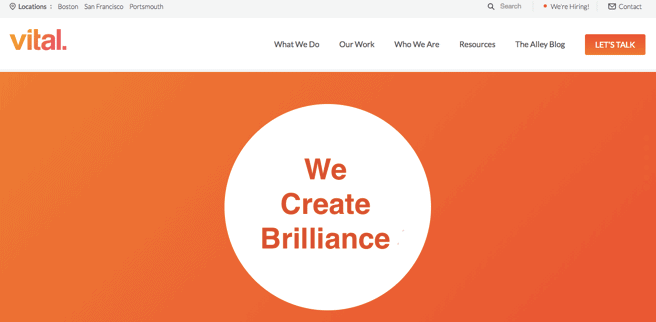
Here’s Vital’s banner to give you an idea of what we’re talking about: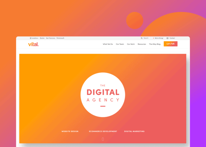
Remember: No matter what, a billboard should be clear and simple. It absolutely must explain who the heck you are and what the heck you do. Otherwise, people are going to hit their back button.
What Do You Want Your Visitors to Do?
Your website banner also needs to consider the goal of your business, which will be reflected in the CTA. Here are some examples:
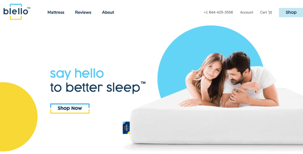
- If you’re in the eCommerce world, you want people to place orders on your website. In that case, including a “Shop Now” button on your billboard (like the online mattress company Blello has done) is a no-brainer.
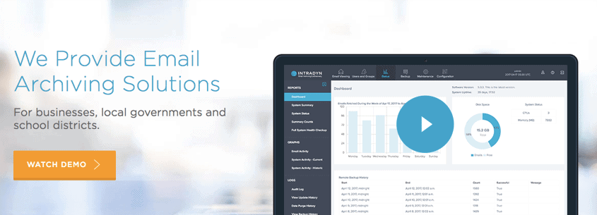
- If you’re in a B2B service industry, you likely want people to learn more about what exactly it is that you do and how you do it better than anyone else. Intradyn’s banner is a perfect example since it clearly explains that they provide email archiving solutions and then gives you the option to click to watch a demo of their product.
OK, now imagine if this was Vital’s billboard:
Great! What in the world does that mean? “We create brilliance” is purely fluff copy and tells the visitor absolutely nothing about our company. That means they would likely leave our site, which would affect our bounce rate, which would negatively influence our SEO, which would affect our Google rankings, and so on and so on.
If someone specifically knew they needed a company that could build a website using Magento, “We create brilliance” wouldn’t tell them they are in the right place. However, “The Digital Agency” accompanied by the bottom link to our Website Design subpage would tell them that we may be able to help them.
Bottom line: You only have a second to communicate what you do. If you’re not clear, a visitor is going to click the back button and find someone else in the search results that immediately says what they want to see.
How Big Should the Website Banner Be?
The size of your banner is going to determine what else you can fit above the fold. In other words, the bigger your billboard, the less other stuff people will be able to see on your homepage.
For Vital, this is fine because we have links to our three main services on our website banner. But if you’re a company t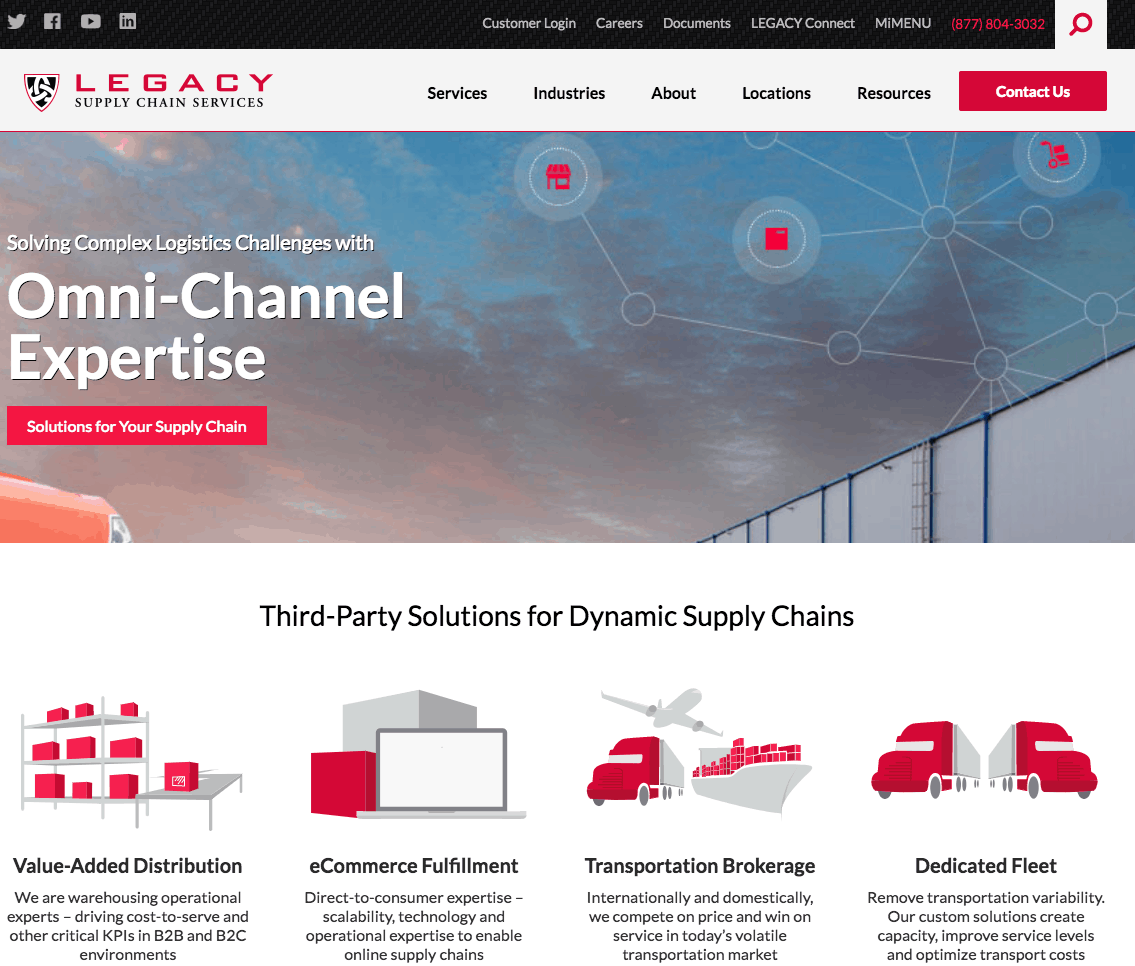 hat offers a ton of different products or services, you might want to utilize a smaller billboard so that you can tease a section below the banner that lists some of them.
Here’s a good example from our friends at Legacy Supply Chain Services, a third-party logistics provider ☞
What About a Rotating Banner?
A rotating banner allows multiple pieces of content to exist in the same top-billed section of your website. In theory, this type of banner is great. You can communicate several messages, you can play with the design and you can feature your latest news — all in the top section of your homepage! What could go wrong?
EVERYTHING. Rotating banners can be conversion killers. Here are six reasons why:
- First, sliders add to the load time of your website if not done correctly. The longer your website takes to load, the worse your SEO and user experience will be.
- Second, your messaging gets jumbled and your main point gets lost. Saying six different things on individual banners isn’t really being clear, is it?
- Third, sliders don’t work on mobile. And 56% of people are viewing websites on their mobile devices, so it’s smart to have a website banner that will work well on smartphones.
- Fourth, people are impatient! When was the last time you waited for every single slider image to load on someone’s homepage? You want answers now, and you deserve them now!
- Fifth, on the off chance that people decide to wait to view every single slider, this is going to slow them down from scrolling further into your homepage to view important features like your products, services or social proof. Plus, a website slider promoting an award you’ve just won could distract them from learning more about your service differentiators.
- Finally, this is the most expensive area of your website to experiment with. As we’ve said, people discovering you for the first time are likely landing on your homepage first. If they don’t see what they need as soon as their eyes meet your website banner, you can guarantee they are going to press that back button faster than your next slide can load.
Most of the time, the content you want to put into a slider is better suited for an email or a social media post. This is because people in a research and evaluation phase of the buyer’s journey aren’t interested in what booth you have reserved for your next trade show. They barely know what it is that you can do for them, so why would they be?
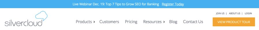
But if you feel like you absolutely must let your new website visitors know about an upcoming trade show or an award you recently won, why not use an announcement bar like SilverCloud does? This doesn’t take any space away from your website banner and it’s still top billing. Otherwise, sliders should only be used if you’re at an Apple-level of brand recognition and understanding.
Homepage Banner Design Tips
To recap, keep the following tips in mind when you’re planning your homepage banner:
- Use an attractive, authentic banner design that avoids stocky, fake images
- Be clear, simple and straight to the point in your headline messaging
- Include a CTA that respects your goals and your visitors’ needs
- Size does matter — especially if you want to tease a products/services section
- Don’t use a rotating banner unless you’re at an Apple-level of brand understanding
With this article and our navigation and header design blog, we’ve done a complete overview of how your website should look above the fold. But that’s only a small portion of your homepage! Stay tuned for the upcoming chapters in this series that focus on your products/service section, social proof, footer and more. Or if you can’t wait, give us a shout and we’ll give you the lowdown.