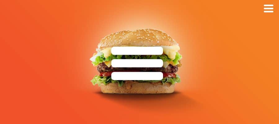
Meet the Hamburger Icon
You’ve seen it. Maybe on your Facebook app, or that paleo-vegan-kale smoothie recipe site you visit every morning — you can’t quite pinpoint where, but you’ve seen it.
The name is pretty straightforward: It obviously refers to the shape that looks like two buns and a patty. The hamburger icon is usually found in the top or bottom corner of websites and apps and indicates to users that there’s more to explore beyond those three lines.
While hamburger navigation has seen its fair share of success, it’s also been embroiled in controversy. The hamburger icon has come under fire within the user interface (UI)/user experience (UX) community due to its use on desktop designs. It tastes good, but it’s bad for you, they say. The hamburger’s public image went from grass-fed Kobe beef to a slimy Big Mac hiding behind the glossy veneer. But are there cases where using hamburger navigation makes sense?
This article will give you a quick glimpse into what that hamburger navigation icon is, when it makes sense to use it, and the debate surrounding it.
A Quick History Lesson: The Evolution of Screen Size
Created by former Xerox product designer Norm Cox waaay back in 1981, the hamburger icon was originally designed to indicate a list within the Xerox “Star” system.
For years, the hamburger icon lay mostly dormant, emerging randomly in various interfaces.
Then came the smartphone. Saving screen real estate became a priority, and flyout menus, triggered by the hamburger navigation icon, became la mode du jour. First came the tabbed navigation from the native iOS apps: typically, four to five icons anchored to the bottom of the screen, which represented the primary menu items.
Then, in 2010, Mr. Ethan Marcotte came along and turned the industry on its head with responsive design. Site visitors no longer had to double-tap for content; instead, content was hierarchically architected within a single full-width column. This change also required designers and developers to account for the 15-item horizontal desktop navigation. Enter hamburger navigation, which pushed navigation up into some unseen oblivion, only to be revealed when the user actively looked for it.
In 2012, the hamburger menu, now firmly established within responsive design as the go-to for navigation consolidation, started creeping into desktop layouts. These layouts were gorgeous, and designers saw how clean and simple their sites could be without the clutter of a three-tiered navigation filled with drop-downs, social icons, search bars, and utility links.
For a time, this trend was joyously embraced — then, something happened. Once considered an elegant and functional design solution, the hamburger icon seemingly crossed the rubicon and broke some kind of Dieter Rams commandment.
Fast Food Functionality

Hiding your navigation on desktop has sparked quite the debate in the UX community.
Misusing the hamburger (as with any UI element on your site) can be damaging to your UX, much like a Big Mac can send you straight into a vomit-laden food coma. The problem arises when a designer is presented with an overly complex navigation and utility bar; in an attempt to make the site look clean, they deploy the hamburger icon without any real forethought. This is where the term “basement” comes from when UX designers talk about off-canvas navigations: It’s under the page and filled with crap. So, why would you hide navigation items? That’s a valid question, one that needs to be explored and tested during the prototyping phase of a site build.
Power in the Pattern
Some things just feel right, and anyone who has opened up an off-canvas navigation can tell you it just works. The tactile feel of content sliding to the side and refocusing your attention without causing you to lose your current place on the site is rewarding. It also allows for your focus to be placed on the actual page content, unhindered by extraneous clutter caused by navigation.
As humans, we love to discover things; it’s in our nature. Because of this, we’re driven by a curiosity that almost forces us to explore and examine anything we might deem “hidden” or “mysterious.” Of course, this isn’t to say your navigation needs to be hidden. The beauty of the hamburger is that it indicates that there’s something just beyond your view. So, what happens when you can see the navigation on your desktop site, but there’s still a hamburger up in the corner? The true power of the hamburger is that it has no boundaries. It can go far beyond simply revealing your navigation. The entire viewport is at your disposal. Want to go full page, fill it with products, calls to action, a search box, a slider of featured blog posts or resources? Why the hell not.
The hamburger, which is recognizable, is ever-present and indicates that there are important items just within reach that can enhance your current browsing experience. That’s the key — determining if the hamburger is truly enhancing your user experience.
Is the Hamburger Icon Right for Your Website?
During those crucial early months of planning, researching, site mapping, and prototyping, your creative team will need to break down the variables that your project presents in order to make that ever-important decision. Do I need a hamburger menu website icon on my desktop or mobile app? How can I get the most out of screen real estate? According to Localytics, 21% of users get rid of apps after just one use, so it’s important to engage people from the get-go. So, can hamburger navigation help — or will it hurt?
Let’s explore some of the biggest questions that help steer the decision-making process.
How many menu items do you have?
In a perfect world, all sites would be as simple as an agency site — Work, Services, Team, Blog — but chances are you need more than that. So, ask yourself, can I pull out the bare essentials and add the rest to an off-canvas panel or flyout menu? If your current traffic patterns prove that 80% of traffic is flowing to your Products page, why feature your Company page just as prominently, cluttering the page?
Caution: This is a blanket statement. None of this is black and white; it’s all about context.
Hamburger navigation, also referred to as a side menu or navigation drawer, allows for direct access, meanings users can find what they’re looking for quickly and efficiently with just a few clicks. You also don’t want a cluttered and crowded home screen. But remember: Hamburger navigation does hide your content.
Are you building a web app or a simple responsive website?
Apples and oranges, I know, but the functionality between native apps and responsive layouts is starting to merge. Typically, a web app will have a small set of interactions the user wants to repeat over and over again. Because of this, the user interface needs to reflect the repetition of the usage patterns, so having the link to a frequently-used feature hidden off-canvas would be a frustrating experience. However, if you have user profile settings or lists you want to access, like on Twitter, the off-canvas basement is the perfect spot to store them.
What features need to be ever-present?
ECommerce sites are unique in that they add a second level of interaction by giving the user a profile, cart, wish list, product search, and so on. These become navigation items, as each item has a page dedicated to it. Typically, these items end up in a utility bar, which can add unnecessary bloat to an otherwise clean UI. Adding these to a flyout menu is a great option.
Have I structured my content with a solid conversion strategy?
If you work with an agency using inbound marketing best practices, then the answer is yes. Without clear calls to action and an expertly laid out conversion strategy, you should likely avoid off-canvas navigation. Oftentimes, a website requires the navigation to be present at all times because the content is not built around conversions and education, resulting in content dead zones that rely on using the primary navigation to continue exploring. Inbound marketing best practices allow for the freedom to stay on-canvas or venture off-canvas.
Are There Hamburger Icon Alternatives?
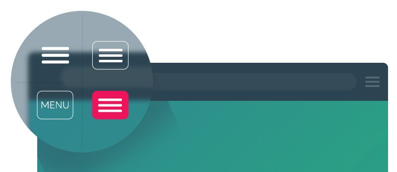
One way to boost the hamburger navigation icon is to include a label. According to the Nielsen Norman Group, desktop users opened the hidden menu in 27% of the cases, as opposed to visible navigation in 48% of cases and combination navigation in 50% of cases. In other words, labels may help. Case in point: James Foster of Exisweb conducted an experiment to see if modifying the hamburger menu icon would change anything. The results? Users clicked the icons labeled “Menu” as much as 20% more often.
Mobile app alternatives can also include a tabbed navigation, tabs with a “more” option, a progressively collapsing menu, scrollable navigation, and dropdown menus.
Why You Should Consider Avoiding Hamburger Navigation
Direct access is important, but does that mean that hamburger navigation is right for you? It can be less intuitive, and sometimes the icon isn’t easy to see, which can mean low engagement numbers and frustrated users who can’t find what they’re looking for right away.
As we mentioned, there are definitely alternatives to the hamburger icon, so you have options. But remember…
It’s all about context.
“There is no more dubious phrase than ‘studies have shown’. Five minutes from now, studies will show something different.”
-Randy Cohen, New York Times
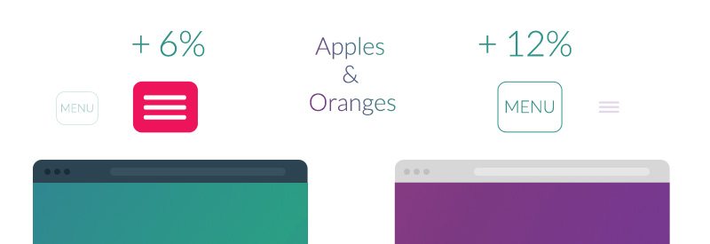
Ten minutes worth of Googling and you can find numerous case studies highlighting how much of a positive effect a hamburger icon can have on your site ROI. You can also dig around and find just as many instances of the icon being used poorly and actually hurting the UI of the site. ConversionXL ran a test on an eCommerce site that showed an increase in revenue of at least 4% or more depending on the style of hamburger menu icon. The crew over at ExisWeb ran a similar test that yielded very different results (+12%) when the hamburger icon was replaced with the word “Menu.”
This isn’t intended to be a sales piece but rather an educational reference hell-bent on showing you how powerful the underlying pattern of off-canvas content can be. The hamburger icon is simply a conduit that triggers the needed receptors to clue your brain in that there’s more to see. It really is up to the strategy team in charge of the UX of your site to weigh the unique pros and cons objectively and come to an informed conclusion.
We fully support and actively perform A/B testing on our inbound client projects to constantly evaluate all buyer journeys and improve conversions. It’s amazing what you can learn in a short amount of time. That giant navigation that you decided you ABSOLUTELY must show at all times, just might perform better off canvas.
So, this begs the question, should I use hamburger navigation on my next site?
You won’t know until you test.
In closing, please enjoy this gallery of hamburger-icon/flyout-menu-triggered awesomeness.

See the Pen Hamburger Menu? No Thanks, I Prefer Hot Dogs. by Sean Dempsey (@seanseansean) on CodePen.


